
![]()
The Zorin OS 15 series, released last week in beta, introduces many changes to its desktop interface and utilities. It keeps Zorin on track with its goal of maintaining a Linux OS for everyone, not just advanced Linux users.
Zorin OS 15 beta is the first major release since Zorin OS 12 in late 2016. This edition is well worth the wait. Major releases of Zorin OS come only once every two years. Minor updates are released every few months as needed.
Zorin OS 15 is based on Ubuntu 18.04.2 Long Term Support. However, much of Zorin OS’ connection to Ubuntu stays under the hood. What you see on top is a solidly designed computing platform that lets you work without distractions or frustrations.
The so-called Zorin Desktop is based on an integration of the GNOME shell. However, Zorin’s spin on integrating GNOME goes far beyond a plain GNOME desktop design. The Zorin desktop integrates a Windows 7 appearance that makes the way GNOME works familiar and comfortable, especially to those migrating from that other computing platform.
Zorin OS 15 beta has some of the latest technology that further highlights what this distro does best: It provides a Linux alternative that lets Windows users enjoy all the features of Linux without complications. This latest release takes the distro’s 10 years of development to the next level.
Developers have refined every element to offer a desktop experience that combines classic desktop technology with a user-friendly design. One of Zorin OS 15’s most impressive accomplishments is cementing a tighter integration between Linux desktop and Android mobile devices.
The features that help accomplish this goal include syncing the phone’s notifications with the computer, and the ability to browse photos on the computer from the phone. More than syncing content, new features bring the ability to reply to text messages and view conversations with contacts from the computer, as well as share files and Web links between devices, so that the phone serves as a remote control for the computer.
Zorin OS Primer
The Zorin OS comes in three options, but only one of them is cost-free. Zorin OS Core is a fully functional free edition that is more than capable of handling typical personal computing needs. The Core edition is a comfortable choice for small business and home users.
The Ultimate and the Business editions target business users with more advanced feature sets included. They each provide levels of user options that extend beyond the core feature set.
If you are not driving a small business or larger company-wide deployment, you will not miss, nor will you need the commercial or pay-for-support add-ons. The most noticeable commercial features are wrapped around letting you tweak the Zorin Desktop environment to look more like the classic GNOME or macOS configuration.
The features in the Ultimate and the Business editions go beyond what the Zorin Core edition provides. This review focuses on the Core, or free, edition.
Zorin Core Up Close
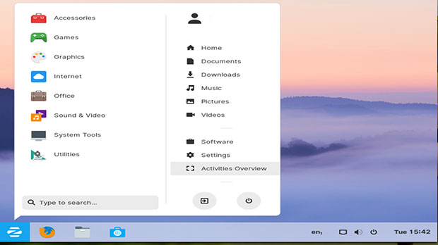
The Zorin OS 15 beta desktop looks like classic Windows or any number of Linux GNOME distributions. It has a standard panel bar across the bottom of the screen.
The left side of the panel is home to the main menu button and several launch icons. Adding frequently used applications to this bottom panel takes only a right click in the main menu. The right end of the panel houses the notifications tray and systems tools launchers.
The panel bar has limited functionality beyond docking opened applications. It lacks applets, quick launch icons and a workplace switcher. That is a GNOME design restriction.
The main menu display shows category lists until you select one. Then a list of applications replaces the general listing. So finding and launching what you want is fast and easy.
A second column in the main menu panel lists storage places such as Home, Document, Downloads, Music, Pictures and Videos. Clicking on these launches the File Manager application and displays the contents of that location. It also provides launchers for the Software package manager to add/remove applications, the settings panel, and the Activities Overview panel.
A search window sits at the bottom left of the main menu. You will also find Log Out and Power Off buttons there.
A limited list of options pop up with a right-click on the desktop. These let you change the background, open the display settings panel and the Settings control panel.
Overviewing It All
The Zorin Desktop brings added functionality with the Activities Overview. You access virtual workspaces from the main menu pop-up or by tapping the logo/super key on the keyboard. You can also click the Activities button on the bottom right of the main men panel.
The Activities Overview is a very handy feature. In the GNOME scheme of things, Activities is the replacement for a traditional workspaces switcher applet on the bottom panel. Open windows on the current screen dock on the bottom panel.
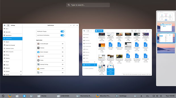
The Activities design feature shows everything that is happening on workspaces that otherwise are not visible on the current screen. It shows a thumbnail view of each workspace on a slide-out panel from the right edge of the screen. It also shows an Expo view of all the workspaces in the center of the screen.
You can group applications in the same workspace or drag open windows to new or other workspaces. New workspaces are added dynamically and are much easier to access. You also can right-click on a window border to move the window to a different workspace.
In Activities view, a Search box displays at the top of the screen. As soon as you start typing, you see a list of all related file matches, both on your computer and on the Net. The results are displayed on the full screen over muted background in a heads-up display fashion.
Enhanced Desktop Improved
Zorin’s developers did more than give normal GNOME a prettier face. They made the interface more functional. I am not a fan of the GNOME interface as it appears in most GNOME desktop iterations. However, its execution in Zorin OS 15 beta makes it much more palatable and inviting for me to use.
Zorin’s new desktop look and feel is refreshed and refined. It presents a more welcoming desktop theme, sporting clarity and simplicity. New animations make the user experience feel more fluid.
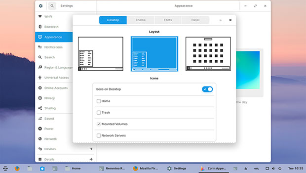
The new desktop theme is available in six color variants with Light and Dark modes. Choices are easy to enable from the Zorin Appearance settings panel.
Faster performance is key in this release as well. Speed has been a top focus in Zorin OS 15 beta. The desktop runs smoother on a wide range of old and new hardware. With the introduction of GNOME Shell 3.30 and the Linux kernel 4.18, there are performance optimizations at every level of the operating system.
New Desktop Execution
The Zorin Settings application is totally revamped, with a new sidebar layout to make navigating between system preferences faster. Many of the settings panels also have been redesigned and simplified to make it easier for new users to set up their system as they want.
A companion design trick gives you an option to place a button on the bottom panel that works like the classic “show desktop” button that minimizes all open application windows. The “show activities” button displays the workspaces panel on the right side of the screen.
This new button option supplements the existing design that opens the workspaces panel by clicking the Activities Preview button on the main menu or using the keyboard Super key option to show either the main menu or the Activities panel. Change this setting in the Zorin Appearance Panel tab.
Healthier Desktop By Design
The new design lets the desktop adapt to the surrounding room environment to be more comfortable throughout the day. This new adaptive display feature automatically can switch the desktop theme into Dark mode at sunset and back to light mode after sunrise.
The setting to enable Zorin Auto Theme is in the Zorin Appearance settings panel. Click the middle Background option in the newly redesigned Zorin theme switcher.
This adaptive display feature set can reduce eye strain, making it more comfortable to use your computer. Even better, these display features help maintain your body’s natural circadian rhythm. That, in turn, helps with better sleep.
That may not seem important to you, but if your work routine requires you to spend countless hours staring at a computer screen — especially into the dread starkness of nighttime — before your head hits the pillow, Zorin’s new desktop features can be a lifesaver, if not an eye saver!
Touch Better Too
Another innovative feature is the new touch layout. It becomes especially handy if you also use a tablet or convertible laptop or interactive whiteboard. Zorin’s new desktop interface is tailored specifically for touchscreens.
The new design maximizes space for your applications and content. A slide-up display from the bottom reveals the panel to switch between running programs, open the application grid menu, and access system controls and indicators.
Switch to the new touch desktop layout with one click from the Zorin Appearance tool. Select the third layout option on the right.
Multi-touch gestures make it even easier to navigate the desktop. For example, use a four-finger swipe up or down to switch between workspaces. Use a three-finger pinch to reveal the Activities Overview of your running apps and workspaces.
Software Treatment
Zorin OS 15 beta already includes the LibreOffice 6.2 version with the redesigned toolbar and more intuitive interface. Firefox is the new default Web browser. Evolution is included with Microsoft Exchange support built-in.
Snap support was added in the Zorin OS 12 release in late 2016. Zorin 15 is ready for the future of Linux apps with support for all of the major containerized package formats on Linux. Flatpak support is now built into the operating system out of the box. It is simple to add Flatpak repositories such as Flathub to the system and install apps graphically using the updated Software app.
This latest Zorin release makes it easier to keep your computing sessions on track with a neat Do Not Disturb mode. Zorin OS 15 introduces a simple toggle in the message tray to silence notifications.
A related new feature makes your To-Do task lists easier to use and more reliable. The To Do app lets you save your task list locally on your computer or sync it with online services such as Google Tasks and Todoist.
Zorin Connect is based on GSConnect and KDE Connect. It is available on Google Play and integrates deeply into the Zorin OS desktop to merge the experience between your computer and Android phone. Among other things, this connection allows you to accomplish the following more easily:
- Sync your phone’s notifications with your computer;
- Browse photos from your phone;
- Reply to SMS messages and view conversations with your contacts;
- Share files and web links between devices; and
- Control media playback on your computer from your phone, and pause playback automatically when a phone call arrives.
All communications are RSA-encrypted end-to-end, and they utilize your WiFi or local network so no data is sent to the cloud.
Access Zorin Connect from the Zorin menu > System Tools > Zorin Connect.
Bottom Line
I am impressed with the Zorin OS 15 beta release. Zorin OS is not the same old GNOME distro retread. It has a well-integrated and tweaked user interface that makes the GNOME interface much more productive.
This release also introduces the Wayland display server with application sandboxing and improved security. Zorin OS 15 has a lot more to offer. It is a serious contender that should rank high on the Linux hit parade list of easy-to-use and productive OSes.
Zorin OS 15 beta is a solid performer. That bodes well for a successful upgrade or adoption changeover when the final version of Zorin OS 15 is released.
Want to Suggest a Review?
Is there a Linux software application or distro you’d like to suggest for review? Something you love or would like to get to know?
Pleaseemail your ideas to me, and I’ll consider them for a future Linux Picks and Pans column.
And use the Reader Comments feature below to provide your input!













It is great that things are getting better. I paid for version 12 just to say thanks for making something different. Version 12 was just ugly with many bugs and things just did not work well. It was like lipstick on a pig. I AM glad they have put more work into it this time. What they released at the time should have been beta or maybe even alpha software.
Most Linux users like to create their own individual desktop ‘look’ hence the theme options but Gnome is still what it is no matter how much tweaking and extra dressing you give it. This is why for me the Lite version of Zorin was always the better option. I installed Compiz/Emerald into 12.4 and have a much more versatile system with far more custom options.